|
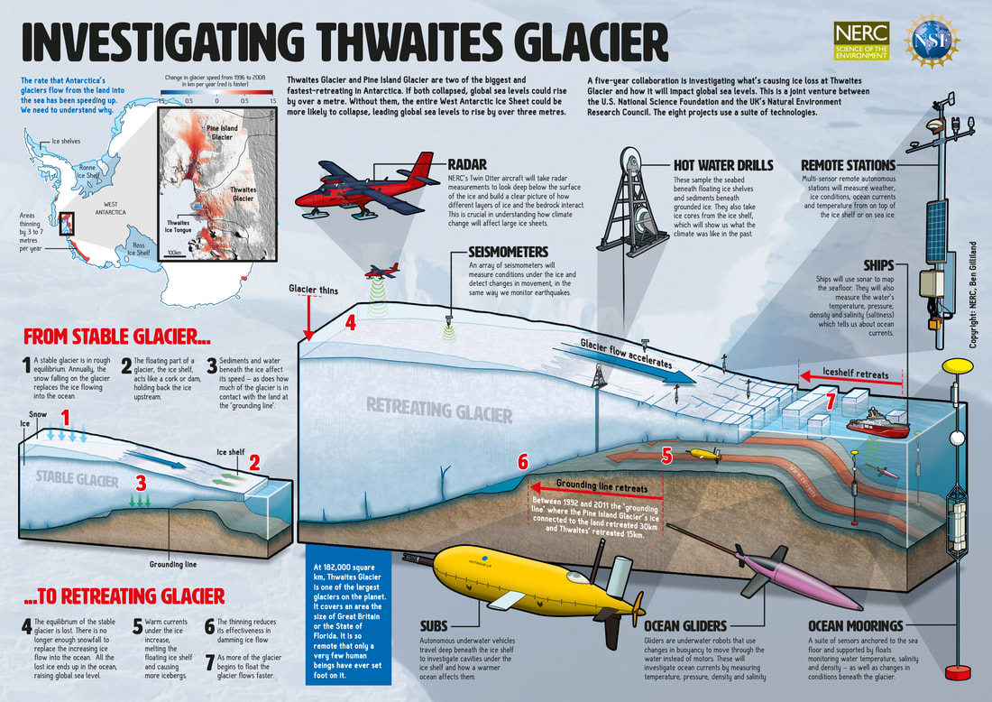
After several months working on projects that focused on the heavens, I was brought back to Earth with a bump (or, with a soft crunch of freshly melted snow) by the Natural Environment Research Council (NERC). NERC wanted an infographic to illustrate a joint UK-US research programme that will investigate ice-loss in the Antarctic. The five-year mission (to seek out new life and new civilisa... sorry, wrong mission) is a joint venture between the U.S. National Science Foundation and NERC to investigate what is causing ice loss at Thwaites Glacier. Thwaites Glacier and Pine Island Glacier are two of the biggest and fastest-retreating in Antarctica. If both were to collapse, global sea levels could rise by over a metre. Without them, the entire West Antarctic Ice Sheet could be more likely to collapse, leading global sea levels to rise by over three metres. Which makes understanding what is causing their collapse and understanding how this will affect global sea levels really quite important. You can read more about the project here. NERC contacted me to create an infographic poster (for use at public events) along with a version for publication in their Planet Earth magazine (which is great, by the way, and free to download) – and they also wanted a series of social media-friendly pullouts. Once again, NERC trusted me to lead the research, writing and (of course) the illustrations and everyone (including myself) was happy with the finished product. You can download a full-fat PDF of the poster here. Infographics are an incredibly powerful tool for communicating complex ideas to customers, the public, or to policy makers.
So, if you think your company, institution... or perhaps evil empire... would benefit from Ben's infographics why not get in touch to discuss your needs? Click here to drop Ben an email to start the conversation.
2 Comments
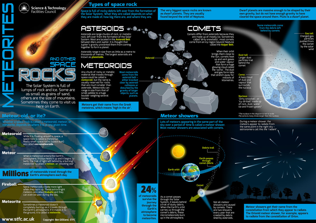
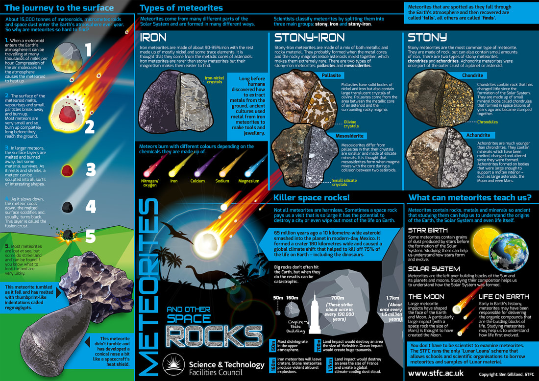
This second batch of additional materials for the STFC's Borrow the Moon scheme was focused on meteorites. Like the Hands on the Moon package (see previous post), the content of the booklet and accompanying posters was left entirely to me to implement, research, write, design and illustrate. Unlike Hands on the Moon, this package would lack the 'interactive' elements, so, after much thought and reflection (during which time, I wandered alone in the wilderness for many days and nights until inspiration was visited upon me as I took shelter beneath the boughs of an ancient oak tree*), I decided to call it the The Little Book of Space Rocks. You can download a full-fat PDF of the booklet here and the poster here. *Sequence of events may have been embellished. Space rocks booklet!...and the poster!Infographics are an incredibly powerful tool for communicating complex ideas to customers, the public, or to policy makers.
So, if you think your company, institution... or perhaps evil empire... would benefit from Ben's infographics why not get in touch to discuss your needs? Click here to drop Ben an email to start the conversation. As part of the revamp of their Borrow the Moon scheme (see previous post), I was asked by the Science and Technology Facilities Council (STFC) to develop some entirely new materials that could accompany and complement the main educational materials. The new materials would also have to stand on their own and be used by students and teachers not lucky enough to have access to the Lunar and meteorite samples. Each new element would take the form of a booklet and an accompanying two-sided poster. With no existing resource to update, this Borrow the Moon 'side project' was entirely my own to implement, research, design and illustrate – it was left entirely to my own judgement and it was tonnes of fun! First up was the booklet and poster to accompany the 'Lunar' element of the scheme, which was designed to be the more 'interactive' of the two by including some activities for the students to complete. You can download the full-fat PDF of the booklet from the STFC's Borrow the Moon website here and the PDF of the poster here. Hands on the Moon booklet...and the poster!Infographics are an incredibly powerful tool for communicating complex ideas to customers, the public, or to policy makers.
So, if you think your company, institution... or perhaps evil empire... would benefit from Ben's infographics why not get in touch to discuss your needs? Click here to drop Ben an email to start the conversation. I spent later the later quarter of 2017 and first quarter of 2018 working on a mahoosive project for the Science and Technology Facilities Council. The goal was to completely redesign the entire suite of support materials for their awesome Borrow the Moon Lunar rock and meteorite loan scheme. The STFC's Borrow the Moon scheme allows schools and universities to borrow samples of lunar material brought back to Earth during NASA’s Apollo missions – as well as samples of meteorites. The scheme has run with great success for a number of years and, after being handled by thousands of students, some of the samples were starting to look a little bit tired and in need of a little rejuvenation. So, while the physical samples were given a spring clean and the number and scope of the samples expanded, it was decided that the accompanying educational materials would also receive a complete revamp and redesign – ready for a grand relaunch in March this year. The splendid folk at the National Space Academy were tasked with developing the materials for the Teacher's pack and the many activities that accompany the scheme. I was tasked with designing it all so it looked all nice and shiny, but was also easy for students and teachers alike to engage with and use. On top of this, I was given the task of creating some entirely new materials to complement the scheme, which I would write, illustrate and design entirely from scratch... but I'll cover those in the next couple of blog posts. The final page count for the Teacher's pack was 62 pages and the Activities pack was at the generous end of 70-odd pages, so I won't share them all here! If you want to check out the materials in their entirety, head over to the STFC's Borrow the Moon webpage! Infographics are an incredibly powerful tool for communicating complex ideas to customers, the public, or to policy makers.
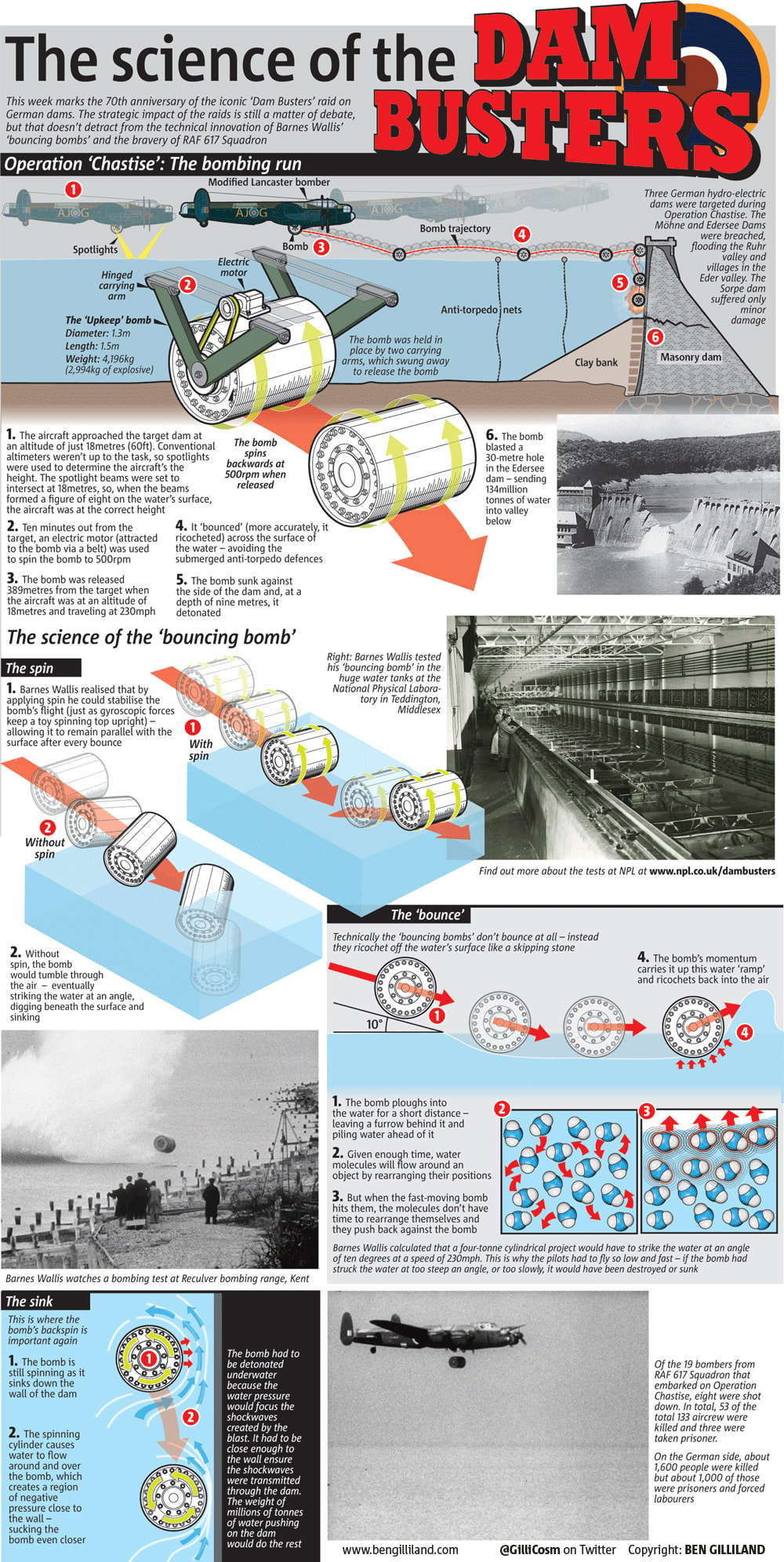
So, if you think your company, institution... or perhaps evil empire... would benefit from Ben's infographics why not get in touch to discuss your needs? Click here to drop Ben an email to start the conversation. Today is the 75th anniversary of the famous Dam Busters raids, so I thought I'd mark it myself by sharing an infographic I produced for the Metro Newspaper on the 70th anniversary. On the evening of May 16, 1943, 19 modified Lancaster bombers set out from RAF Scrampton to attack the dams of the industrial Ruhr region in Germany. The planes of the newly-formed 617 squadron were carrying a very special ‘bouncing bomb’ that, although it would have very little impact on the outcome of the war, would ensure the aircrew that deployed it and the man who designed it would be forever remembered as the legendary ‘Dam Busters’. During the height of World War II, Bomber Command was tasked with destroying as much of Germany’s industry as possible. They had tried targeting factories but these were quickly rebuilt so they turned their attention to targeting the power sources that supplied them – coal mines, oil fields and hydroelectric dams. Coal mines were too easily repaired and the oil fields were too far away, so the dams, which supplied both power and water to industry, became the target. Unfortunately, they faced two problems: firstly, dams are (damn) difficult to destroy – after all they are strong enough to hold millions of tonnes of water at bay (only a very large bomb, or an underwater torpedo strike would do the job) and, secondly, Hitler was aware of the importance of his dams so they were well defended by submerged anti-torpedo defenses. The ‘very large bomb’ idea was abandoned because the RAF didn’t have an aircraft big enough to carry it, so it had to be the underwater option. But how would they get round the defences? Enter engineer Barnes Wallis. He had an idea that, rather than trying to breach the anti-torpedo nets, you could bypass them altogether by ‘bouncing’ a bomb across the surface of the water in the same way that you might skip stone across a lake – the difference being, his ‘stone’ was a four tonne bomb. The final bomb, called ‘Upkeep’, was a masterpiece of innovation and improvisation and, when it was deployed on the evening of May 16, it performed (almost) flawlessly. Of the three dams targeted during Operation Chastise, the Möhne and Edersee Dams were breached, flooding the Ruhr valley and villages in the Eder valley– the third, the Sorpe, was only lightly damaged. If you are struggling to read the text (since it doesn't really get any bigger when you click on it), feel free to right click and download (or just drag to your desktop) and you will get a slightly more readable jpeg.
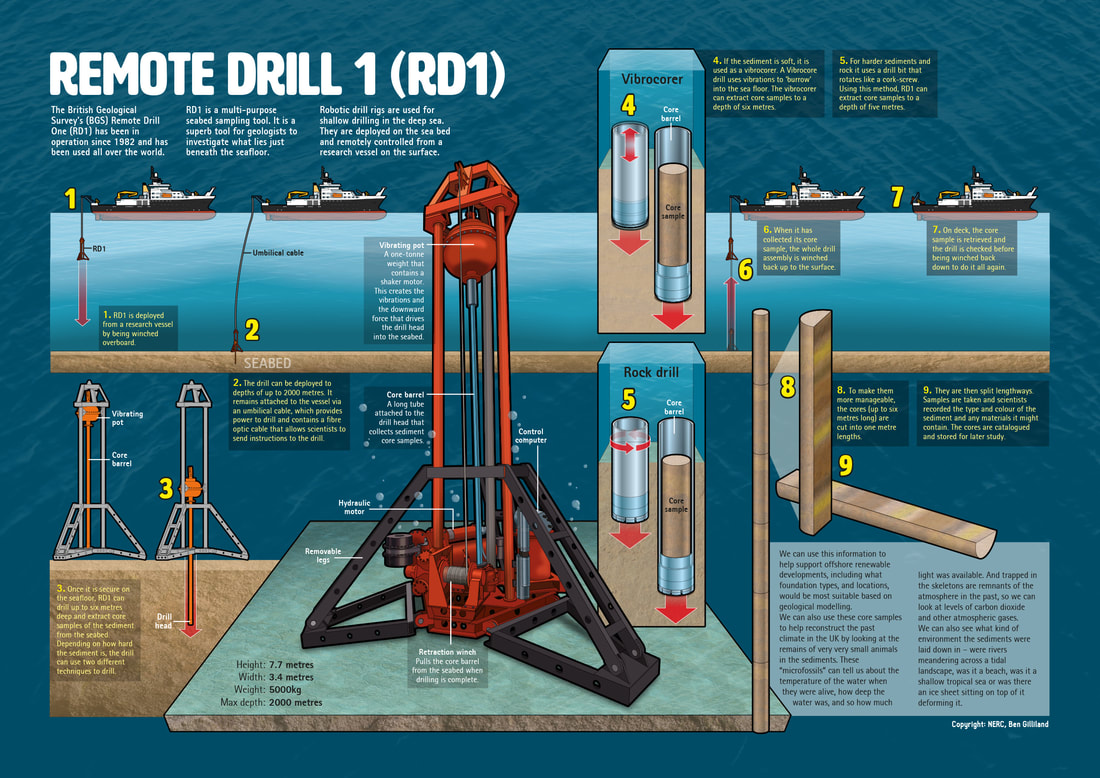
You wait a lifetime for a project about boreholes to come along and then two arrive at once! Following hot on the heals of their geoenergy drilling project, this infographic for NERC (Natural Environment Research Council) plunged me deep beneath the waves with their Remote Drill 1 (RD1). RD1 isn't new – it's been in use since 1982 (which is pretty impressive in itself), but it is still a very cool piece of kit. The drill, which is lowered from a ship and placed on the seafloor, uses vibrations to drill deep beneath the seabed and extract cores for study. NERC wanted the infographic to use as a poster for a public outreach event, at which the star attraction was the drill itself. I also provided reformatted pull-out elements for use on social media and online as well as version for use in NERC's Planet Earth magazine (which is free to download and well worth a read by the way). As well as being fun to draw, it was a joy to be able to talk to the scientists who use the drill and benefit from the samples it recovers – these scientists are, without exception, incredibly passionate about their work and enthusiastic to share it with the public. Infographics are an incredibly powerful tool for communicating complex ideas to customers, the public, or to policy makers.
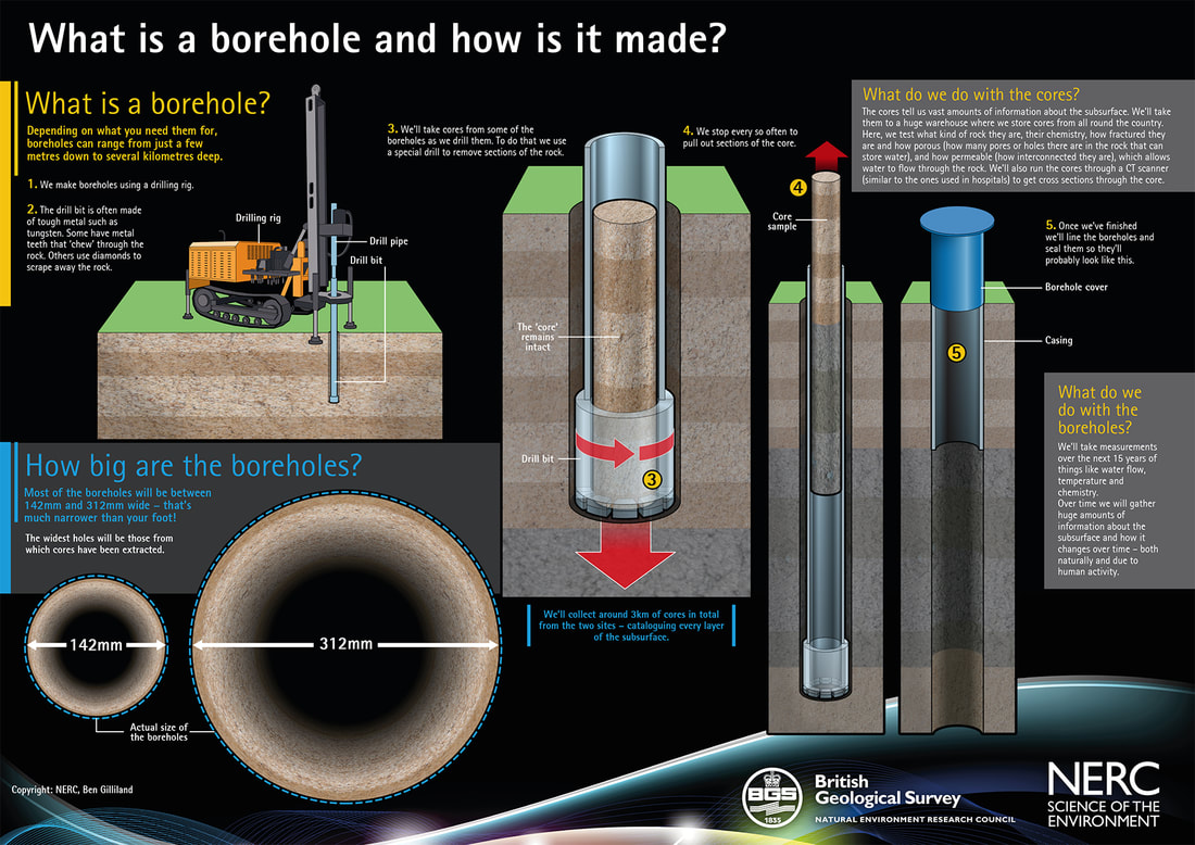
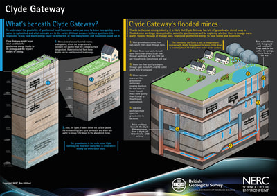
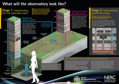
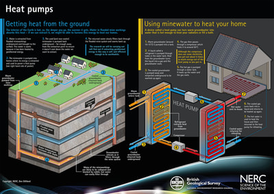
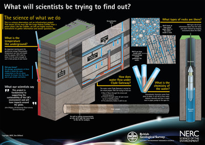
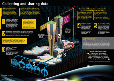
So, if you think your company, institution... or perhaps evil empire... would benefit from Ben's infographics why not get in touch to discuss your needs? Click here to drop Ben an email to start the conversation. Despite having a less than ideal run-in time, this was a really fun project. I was commissioned by NERC (Natural Environment Research Council) and BGS (British Geological Survey) to create a series of large-format posters for a proposed Geoenergy Observatory. The posters were used in two public consultation events in Cheshire and Glasgow (in September 2017) where NERC and BGS representatives addressed any queries, or concerns the public might have about having such a scheme on their doorstep. When complete, the project will consist of about 80 boreholes (of varying depths) each equipped with a variety of equipment and sensors. The boreholes will allow scientists and geoengineers to observe how fluids and gas flow within underground systems and to understand the relationship between the rock layers from the surface to the deep underground environment. Measurements taken from the boreholes will look at issues such as seismic activity, water movement and chemistry. Click the images above to embiggen! Christina Chapman (BGS's project communications manager) said: "I would like to thank you for all the work you did in producing content for our event... there was a lot of work for you and Sylvie to get through in a short amount of time. We’ve had lots of lovely positive comments about the posters – and particularly the boxes. They were great to work with as an interactive device" Infographics are an incredibly powerful tool for communicating complex ideas to customers, the public, or to policy makers.
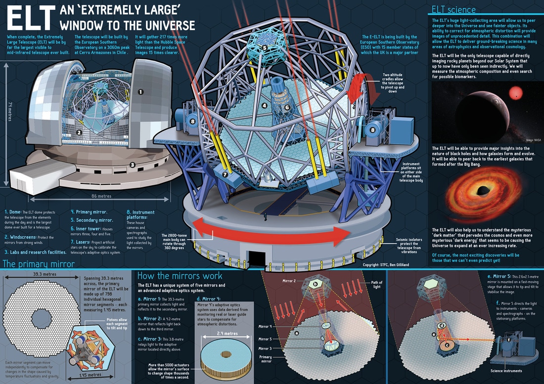
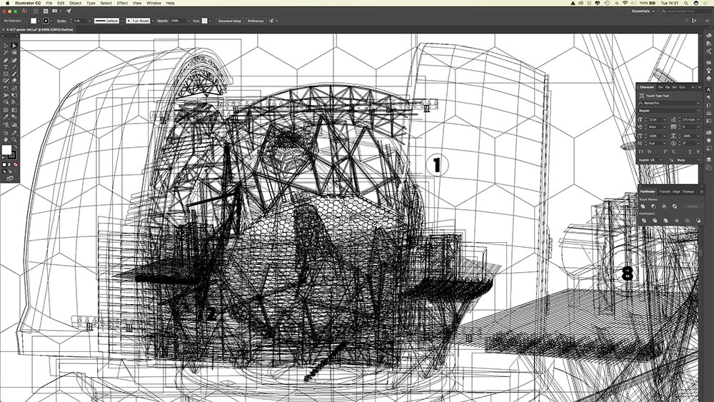
So, if you think your company, institution... or perhaps evil empire... would benefit from Ben's infographics why not get in touch to discuss your needs? Click here to drop Ben an email to start the conversation. This was another splendid project requested the Science and Technology Facilities Council (STFC) – albeit from a different part from that which requested the Lunar Loans stuff (the STFC is a little like Hydra in that respect… or maybe not). They wanted an infographic poster explaining what the Extremely Large Telescope (ELT) is, how it works, and what it will be looking for. Having written several articles about the ELT during my MetroCosm days (although it was called the E-ELT then… with the extra E standing for European), I thought that this would be a nice ‘quick turn-around’ project. However, it turns out that the old adage of ‘familiarity breeding contempt’ was especially applicable in this case and it didn’t take me long to realise just how intensive the job of drawing the telescope would be. It took the better part of three weeks just to draw the main internal telescope structure… I mean, seriously, just look at how much scaffolding-type stuff there is holding that massive mirror in place! For most of that time, I went to bed still staring at the images of metal pipes that had seemingly been seared into the rods and cones of my retinas. Luckily, it came out alright in the end (as did the scaffold-induced retina burn). Below is close-up view of the main telescope structure viewed in 'preview' (a sort of 'wire frame' mode) that shows just how many lines I had to draw to get the finished result... Infographics are an incredibly powerful tool for communicating complex ideas to customers, the public, or to policy makers.
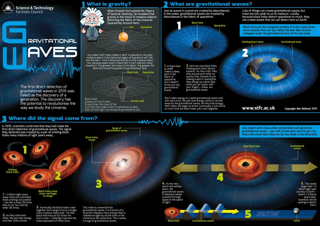
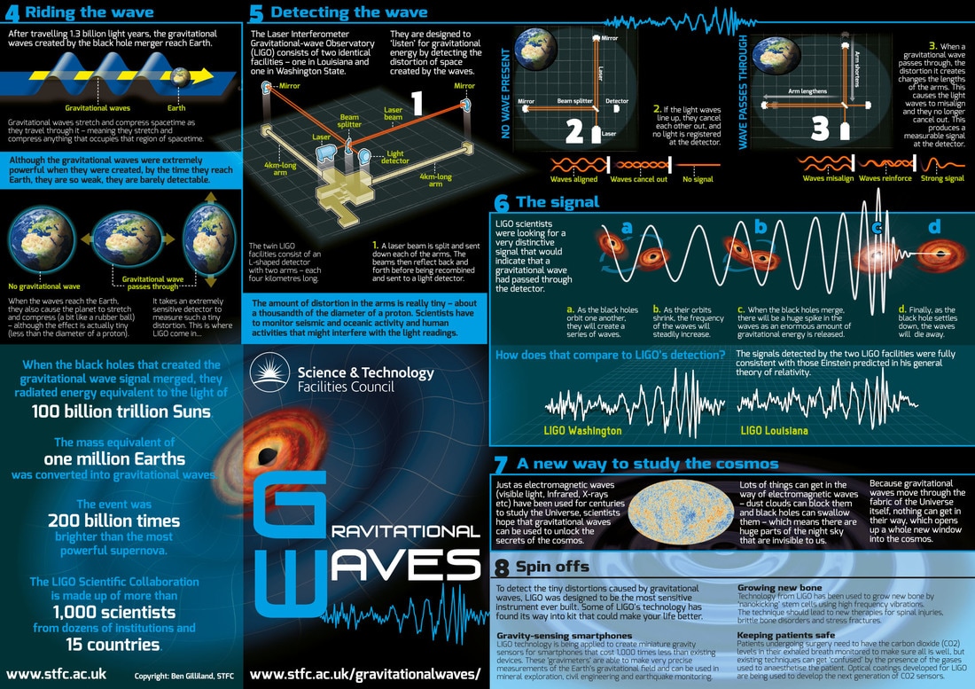
So, if you think your company, institution... or perhaps evil empire... would benefit from Ben's infographics why not get in touch to discuss your needs? Click here to drop Ben an email to start the conversation. The Science and Technology Facilities Council (STFC) wanted a couple of posters celebrating the landmark detection of Gravitational Waves to display at the annual meeting of the American Association of the Advancement of Science (AAAS)… and I was more than happy to oblige. I had written several articles on gravitational wave detection (for MetroCosm, Astronomy Now Magazine and for the STFC), so, being already up to speed with the subject, I did the research for this one myself. I always find that having complete autonomy on the creation of an infographic (research, writing and illustration) to be most satisfying way of working (with the information vetted by proper scientist-type experts afterwards, of course). Fortunately, barring a few tweaks correcting my interpretation of wave directionality, few changes were required and the posters went on a jolly old adventure to Boston, MA… sadly, I didn’t get to go with them. Infographics are an incredibly powerful tool for communicating complex ideas to customers, the public, or to policy makers.
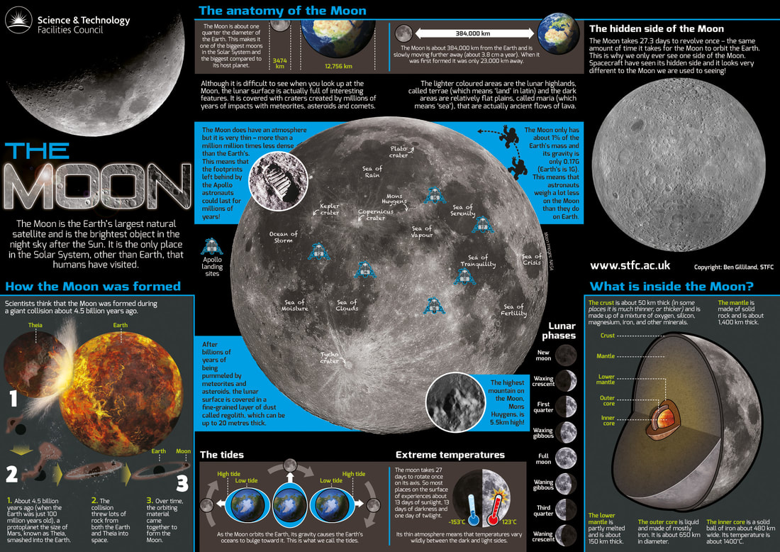
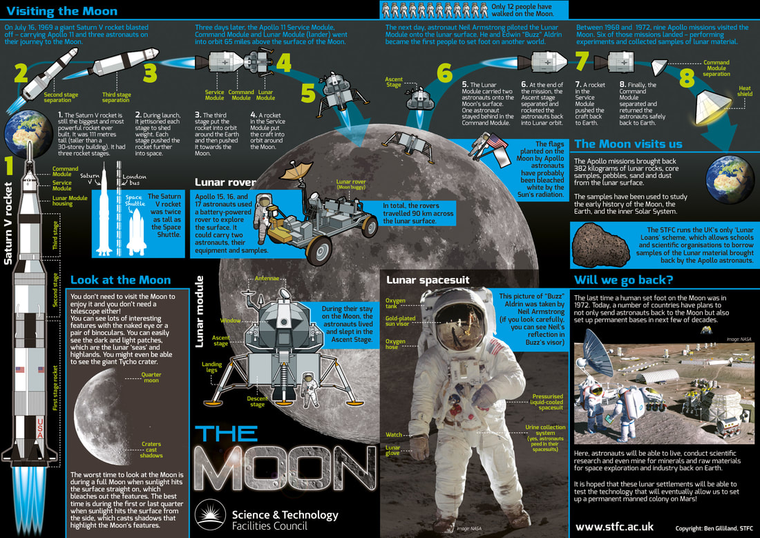
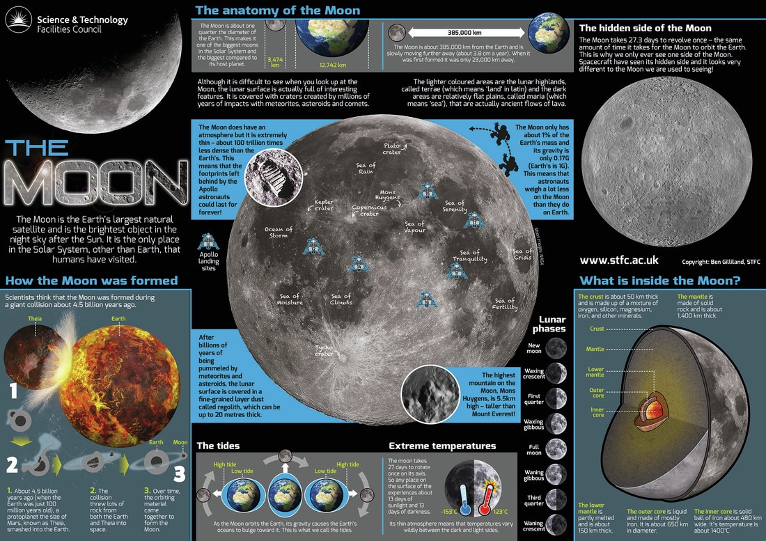
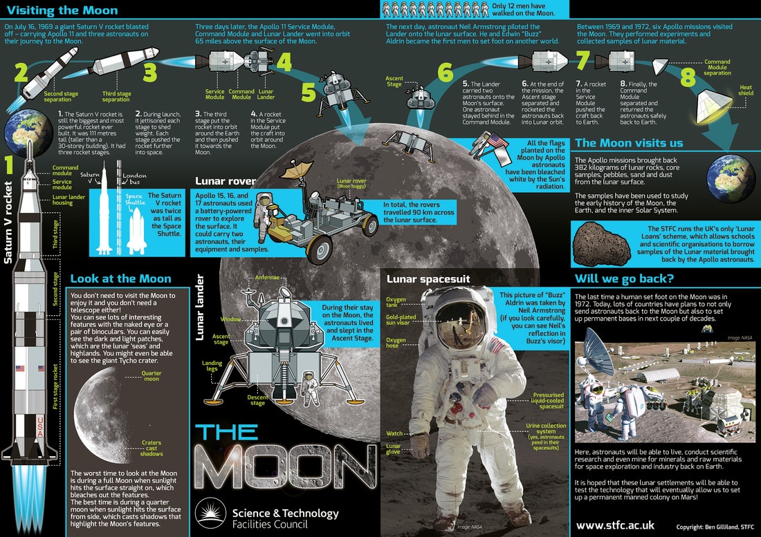
So, if you think your company, institution... or perhaps evil empire... would benefit from Ben's infographics why not get in touch to discuss your needs? Click here to drop Ben an email to start the conversation. As a new year dawned, so did a new project from my favourite government research council. I was approached by the Science and Technology Facilities Research Council (STFC) to redevelop the materials for their unique ‘Lunar Loans’ scheme. This scheme allows schools and universities to borrow samples of lunar material brought back to Earth during NASA’s Apollo missions – as well as samples of meteorites (I know, cool eh?). The project will be ongoing throughout the year, so, to kick things off, we decided to develop a couple of new ‘broadsheets’ (big double-sided posters that can folded into something resembling a booklet) to accompany the revamp. This will be the first time that such posters have accompanied the main package of educational materials, so there was no existing broadsheet to redevelop. This gave me a nice clean slate and free-rein to source the information myself and create the poster as I saw fit… luckily, the STFC also thought it was fit for porpoise (sic). I decided that, this being a ‘Lunar Loans’ scheme, it would appropriate to start with a Moon-based broadsheet… so that’s what I did. *For those baffled by my need to spell out the word ‘Moon’ in the title, it’s a reference to a character in Stephen King’s ‘The Stand’, Tom Cullen, for whom everything is spelled ‘M-O-O-N’.
|
Author
Ben Gilliland is a freelance science writer, graphic journalist, illustrator and author with more than 20 years of experience. This is where he talks about work he has done... on the off-chance anyone is interested. Archives
August 2018
Categories |
Proudly powered by Weebly

 RSS Feed